There has been much ado about inflation lately and in the last 10 years. Central banks have been “trying” to stimulate “inflation”, but have so far been “unsuccessful”. Those quotes are deliberate, because as i will show in this article by virtue of the Federal Reserve’s own statistics; Central Banks (or at least the Federal Reserve) are either criminal enterprises designed to enrich their friends, or have become so corrupted by incompetence it falls under criminal negligence all the same. This because they have been hiding inflation (again, deliberate or otherwise) in stocks and related asset prices, creating essentially “dead money” (on purpose or otherwise) which Artificially Suppresses Inflation. And i have the charts to prove it.
This is no news to the inundated, but I’m trying to provide answers to all people out there. Including those who are not familiar with economics, who listen to the people in charge say one thing, but their own reality tells them something else. Not to mention there are plenty of pundits confused by all this talk from on high. So permit me to explain Inflation first.
Inflation = More Currency.
Now that I’ve expl…. What? Oh you want more? It’s not so simple you say? But it is; and the chart will prove it. But I’ll go a bit deeper. There’s actually 2 components to inflation: When it is created, and when it “Hits”. Or put differently, when the newly created currency starts circulating in the economy. Think of it as an arrow shot from a bow; the moment the arrow is released, the path forward is inevitable, but the target has not been hit yet. The dynamic between 4 sides; currency Made, currency Destroyed/currency Moving and currency Locked in Place is what in the end creates the metric you know as “inflation”. Maybe it is easier to think of it as 2 sides of the same coin: Currency Available (currency made and moving) and Currency Unavailable (currency destroyed and locked in place). There’s much more things at play such as the demand for currency, but those are all what’s called “second order effects”, or, “Shit you don’ need to worry bout, let the bean counters deal with it”. If only they did.
One of these 4 corners of inflation is important to keep in mind as we go forward, namely the “currency locked in place” corner. I already referred to it earlier as dead money because currency that’s not moving doesn’t cause inflation. Meaning, it’s not passed on from person to person, meaning its velocity is 0. This is FAR more important then it seems, because all economic interactions are human.
All economists agree that if there is more currency available, prices must go up. Many sides agree for many different reasons, but that is the empirical effect measured over the entirety of human civilization. But nobody ever asks the question; How do all these separate individuals KNOW that there’s more currency available? Nevermind now, what about 400, or even 1000 years ago? Well; outside of any large events or decrees the answer is simple: Either in their local area there is more coinage, or they don’t experience inflation. Not until events outside their control force their hand (such as a neighbor spending frivolously going on a raid for more money). Newsflash: Most of history is really shit. We are the 1%.
Inflation doesn’t arise from any one person knowing any one thing, it arises from the general knowledge of people within several local or national regions that there is more currency available. And this knowledge usually spread with the amount of currency available. If there is a ton of currency in village 1 but almost none in village 2, assuming the same purchasing power of the currency(s), prices in village 2 will be considerably lower then in village 1. You might say “well that’s not fair, then village 1 can buy all of village 2’s goods!”.
…

Ahem.
Despite the entertainment i want to emphasize another word in that paragraph that’s important to keep in mind going forward: Local. The interaction of Local and General knowledge is paramount when it comes to inflation. What I’m writing here isn’t known to you; it becomes known to you as you read these words (and these and these and these….). Since i can assume there will be a considerable number of people reading this, instead of Private knowledge (mine), it becomes Local knowledge (the community around me reading this). If it spreads to other communities through sharing it online, it will upgrade to Regional knowledge (the finance sphere). Should it truly go viral, THEN and only then can it be considered “General” knowledge. As you can see, local/regional in the digital age no longer needs to mean localized to any geographical region, as travel of information has become separate from the travel of humans. No village is “air-gapped” from another anymore.
Whether inflation is felt or not, simply depends on the interaction of local communities until the knowledge of a increase in currency has spread to all involved local communities. Events can upgrade this knowledge from local to regional or beyond, either speeding it up via many small events or directly upgrading it through major events (such as decrees). If you are able to contain the knowledge of additional currency to a singular local group, and convince that group to keep shush (either via direct communication or simply economical incentive such as ever rising prices and wealth tied to those prices)… Well then there won’t ever be General inflation, because there is no General knowledge of increased currency, because there is no General Circulation of said currency. Only Local inflation will take place.
This brings us to the chart.
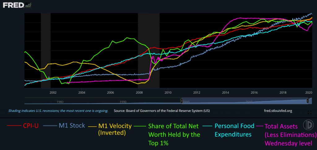
Before we continue with theory, this chart needs some practical explanation first, mainly why you’ve never seen such a massive 10 year correlation before and why the chart looks a bit… off. Both reasons basically come down to how i make charts, so let me add that in here too. First off something important; Chartists will have noticed that there’s no Y axis measurement. This is because the Y axis doesn’t matter.
…Can somebody please check the chartists that just started foaming at the mouth? Thank you.
To continue, Here it doesn’t matter because we’re specifically not looking for values. We’re looking for correlation between multiple measures which are measured in completely different values and in completely different ways. See, the FRED (which is where all this data is from, this is all official data) offers the ability to customize charts on their website, so a lot of people who watch FRED charts work with combining datasets and formulas and such. I can’t do that and i can’t be bothered to try, because it’s too limiting. There’s either no way, or it’s excessively hard to add and compare CPI-U (which is an index) to say M1 stock (measured in Billions). Then there’s the time scale problem, because some measures come out quarterly, some weekly, some daily, some monthly, and they’re not always unifiable. I did try to go through it, but it’s so god awfully cumbersome. This is one of the reasons why these measures generally don’t get compared together.
And that is also why the Y axis doesn’t matter in this case, because it’s different for most the measures measured (and the base from which they start as well, such as the CPI being indexed to 1980) and as such should be kept in mind for each measure separately (and putting ALL those numbers up there really confuses the issue for people who don’t stare at numbers all day). What DOES matter, what is VITAL is on the chart: Whether the line went up or down. Yeah, sounds stupid i know, but that’s what chartists do at the core – look at lines over time and determine whether it goes up or down next based on what it did previously. That’s what correlation is, the vertical movement of two lines lining up over horizontal movement – Time. Which is what the X axis is, which IS important, so it is there. These lines are comparable because the timescale has been “normalized” (meaning lined up) from January 1st 2000 as a starting date (or relevant dates such as Q1 2000) to January 1st 2020 as the ending date; 20 years exactly before the extreme moves due to the pandemic messed up the long term pattern on the chart. As you will see soon though, the pattern holds up EVEN in 2020!
But to stay with the chart; All that matters is that the X axis is time; all 6 chart lines have their timescale lined up as exactly as i could make them, and the background boxes where the same size. Naturally you can’t see this now because i had to cut out the lines to make them ‘transparent’, but trust me i lined everything up beforehand on the basis of pixels. Even though I’m not very good at 2D stuff (i use Paint.net in a very basic manner) i do know tech, so i know the algorithms will scale everything just perfectly for me on a pixel scale, no math needed (…cause that’s what the algorithms are…). Sure, it’s not 100% exact, but that only increases the error margin slightly – it doesn’t invalidate some very obvious correlation.
These are the 6 charts i used and combined into one: The CPI-U in red is the broadest measure of inflation, as defined by the government… every 5 minutes or so. M1 stock in blue is the most “Cash” measure there is. Meaning this stuff is actually circulating currency in the form of bills, checks, or some strict electronic measurements. Anything that can be used for legal tender immediately, basically. M1 velocity in yellow then is how “fast” this currency changes hands. This goes to the level of knowledge about the amount of currency in local/regional/general communities and their propensity to spend it, so it’s a very confusing measure to go into when you start digging. So if you’re not of the crowd who “gets it”, just assume the bean counters are right on this one, it’ll suit our purposes just fine.
Share of Total Net worth held by the Top 1% in green is exactly what it says it is; convert all assets to dollars, see who owns them, then compare it against their income. Then the Share of that wealth of dollars of the Top 1% of income earners is what this line is. Personal Food Expenditures in cyan is the total amount of currency households in the US spent on food at any given time. In other words, this is where the vast majority people in the US will “feel” inflation, because everybody needs food, yet everybody only needs a maximum amount of food (i shall refer to this in an example later). Finally, Total assets held by the Federal Reserve in purple is also exactly what it says: All the stuff the Fed has bought. This series starts at the end of 2002, so the line’s a bit shorter (scaled a bit roughly to the same time frame).
Now that we’re up to speed on how to actually read the chart, everybody should be able to tell the obvious: Before 2008, everything is a mess, but after 2008 everything seems to line up. That would be the correlation kicking in. And in the middle of that big shaded area between 2008 and 2010, M1 seems to pivot up. From that moment onward, the mess of lines become like one flowing river all going in the same direction. That Pivot is QE – the moment the Emperor turned into an Exhibitionist.
Congratulations, you just realized that QE is inflationary. But why hasn’t the population felt it? Why is it still hidden? Well; Allow me to explain that mechanic.
Imagine, you’re just Joe Average, blue collar worker. You have a wife and kids with a full-time job, living the dream. You don’t have much in salary, but what you do like to do, is to treat yourself to a tasty Hotdog every day. You buy these at your local hotdog vendor for $2 a hotdog – a fair price you think. Every so often you meet a guy there who’s a millionaire, also with a taste for hotdogs. Though, having basically unlimited funds when it comes to food, he really treats himself and buys two.
Then in 2008, the market crashed. Oh no! Hotdog sales are down! We must save the system! Let’s make the Millionaire a Billionaire so he can buy more hotdogs and stimulate the economy!
…. Yes.
Yes that is exactly what happened. That is why the Share of Total Net Worth of the Top 1% is in that chart, and is why it lines up with the rest of the lines. Because a VERY large portion of that wealth is tied up in the Stock Market or similar assets such as Luxury Real Estate (remember locked up currency?). Feel free to compare this chart side by side to the NASDAQ, though the correlation between Fed assets and the S&P is well documented at this point (that is why it’s not included, spilled milk and all that).
Now, going back to our example with the hotdog salesman, naturally the Now-Billionaire doesn’t feel any “need” to spend more money on Hotdogs. He’s already having his fill with 2. This is how the price of Hotdogs can stay muted compared to the share price of large companies. Because the “Need to Spend” did not increase within the Local Hotdog-community. However, the Now-Billionaire does have a need to park his currency somewhere and while rates are at 0%, saving accounts are out. Because let’s be frank: Even More currency is even better right? No need to deny it we’d all do the same thing. That’s the whole point. Don’t forget the Now-Billionaire and Joe Average both enjoy hotdogs.
The reason why this suppresses inflation but doesn’t outright kill it is because of those pesky second order effects nobody at central banks seems to think about (while it’s THEIR JOB). Namely, billionaires ARE just humans who enjoy a hotdog. Yknow what they also enjoy? A Yacht. Yknow what they also enjoy when they have a Yacht? A Bigger Yacht.
Well those Yachts don’t build themselves. They are built by people with salaries. More people working in high margin industry means more people with money for 2 hotdogs. But you know what another thing is the Rich really like? Exclusivity. And the quickest way to get Exclusivity?
Scarcity. This scarcity is virtually always due to production limitations. Some stuff is just complex, hard to build and takes time. But the point of many goods rich people buy which could be produced more, but aren’t, is because THEY can buy them, while others of less stature cannot.
This also immediately means; there is a permanently limited supply of these goods. Which means, if the billionaires have more cash to spend on these limited supply goods, their prices go up. This directly means more profit for the people making those goods, turning them into millionaires as well. Don’t forget that the people who actually got rich off a gold rush where the people selling shovels and services to the miners. Naturally, this dynamic increases the prices of the limited supply of goods in the millionaire category. The same mechanic increases prices for people in the hundreds of thousands category. As it turns out, Reagan was right, Trickle Down Economics does work… it just works incredibly slowly, then all at once.
Now there are more complex dynamics at play here as well (companies can print more shares, but have reasons not to, causing their share price to rise even though it’s essentially an unlimited asset) so it’s a little more nuanced then simply “exclusive things go up in price”. But this is the simplest example i can give to laymen of second (and third) order effects on how inflation “leaks” into the general economy.
Just to summarize up to this point; the Fed’s been measuring the leak in the dam and calling that inflation. Not the actual water level in the reservoir, the tremendous pressure of which is causing the leak.
To go back to our hotdog salesman; this mechanic continues on for a decade – specifically from September 2009 to September 2019. A decade older and a few gray hairs richer, Joe Average still treats himself to a Hotdog a day. The Hotdog costs $2,66 – a fair price you think. After all it only went up $0,66 over 120 months, or $0.0055 per month. The millionaire, now billionaire, still buys himself 2 every so often.
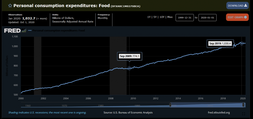
Still sound like a far fetched story? Then why did Personal Food Expenditures go from $774.1 billion in 2009 to $1030.4 billion in 2019 in the United States? An increase of 33,1%. Naturally, 33% of $1 is $0,33 – and 2x $1,33 = our $2,66 hotdog.
So what happened on March 23rd? Well! The Federal Reserve stood up and said “OH NO! the economy is collapsing! Hotdog sales are going down! Quick, turn the Billionaires into Trillionaires!
Yeah it doesn’t get any less stupid the second time around. Or the Fifth, considering we’ve had QE1, QE2: Electric Boogaloo, QE3: The Twist, QE4: Not QE, and QE5: Q-Efninity. I’ve seen Fast and Furious movies more believable.
Point is this has gone on for so long now there are people who believe inflation will never happen, that the government can just print infinity dollars and it’ll be fine. Modern Monetary Theory they call it. Well, it’s not modern since John Law invented it in the early 18th century, it’s not Monetary because it only deals with Currency (they specifically do not propose any intrinsic value of the currency so it can’t be money) and I’m afraid WHEN they put it into practice (because fiscally the US has no choice), it won’t be much of a theory either.
Because the truth is, this correlation is so strong, that it has continued DURING THE PANDEMIC CHAOS!
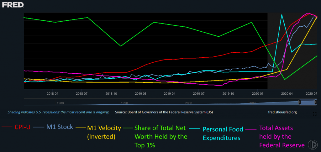
GAZE! GAZE UPON THE BIGGEST SHITSHOW IN HISTORY!
OK so you can’t expect this level of unprecedented event to give you 6 lines that line up exactly but it should be VERY clear to anybody, even those idiots at the Federal Reserve, that they STILL correlate. The green line in this case is that far up on the chart because of scaling with it’s particular Y axis (remember it’s direction that counts). In this case, it actually helps, because it clearly shows some events during the last 2 years (as the green line tends to go down when the stock market does) that prove the Can is out of Road to be kicked down, virus or no – and has been since the 2018 December mini-correction, which I’ll get to in a moment.
Before that i wanted to highlight the key takeaway here and make it VERY clear: When for whatever reason this correlation stops, Inflation hits. And when that dam breaks, considering the reservoir built up, it’ll go into Hyperinflation pretty quickly with no way to stop it (Hyperinflation is literally “just a fuckton of inflation” and nothing else, but it has some psychological effects that are important in theories so it gets defined separately). That is EXACTLY the reason why billionaires “got xxxx billions richer since March”. If they lose too much, if “the top is in”, they will “Take profits” – aka sell their shares and exit that part of the market. And by that i don’t mean “those evil 0,01%ers”, i just mean everybody in general, since nobody in the markets likes losing money no matter how much is invested. Much of the ultra-wealthy’s wealth is truly locked up currency, such as shares they can’t sell for reasons such as it’d compromise their controlling stake. So they will “ride that down” as much as they rode it up, since increasing currency was never the point of said locked up currency… But they always have some extra shares to sell at the top for just such an occasion. They’ll do a buyback later to refill the reservoir.
They’ll then change the direction of their currency winnings (AKA reinvest their gains) and inflate prices in a different sector. Only the stock and bond markets cause an inflation “leak” – should the rich put their profits in commodities, that inflation is felt immediately by the broader economy as those raw resources are used for the base of a lot of goods. Hotdogs use meat (at least some, i assume) which needs to be sourced somewhere. If billionaires sell shares to pile their profits into hogs futures, the price of hogs goes up, and the raw resource cost in hotdogs goes up with it (if it’s pork, i don’t eat hotdogs). Naturally if raw resources cost more, it cost the hotdog salesman more to buy inventory, the increase of which he’ll pass on to the consumer, Joe Average. And that is how the public at large realizes there’s more currency around – they have to spend more to buy what previously cost less.
It’s at this point we visit Joe Average one more time, when does he notice inflation is happening? When after reaching $2,66, the price suddenly jumps to $3 because the raw material cost has spiked up, and Joe Average thinks to himself “I’m not sure the hotdog is worth $3”. We all have this innate understanding of value; no person on the planet would pay $1,000,000,000,000 for a single hotdog, it is merely a question of where each person’s limit is. Once this limit is breached, the inevitable question will follow; “Why is the hotdog $3?”. “Hogs are more expensive” he’ll hear. “Well, why so?” he’ll ask. “Bunch of rich folk bought futures. Somethin bout economic collapse? I wouldn’t know bout that. I’m just a imaginary hotdog salesman”. And knowledge spreads.
In short, on the above chart the problem was that green line took a dive in March instead of spiking up, breaking the correlation. Had that continued, the billionaires would’ve moved all their money out of the stock market and moved it into safety; Commodities such as Gold (this is also why Bernie Madoff blew up in 2008; Had his clients left their money with him they would’ve BEATEN the market in 2008 cause of his pure cash position!). That gold went down at all was what’s called a “liquidity panic”. AKA people on margin getting caught with their pants down and needing to cover with whatever they could find, including the gold plated kitchen sink.
Everybody looks to the Gold price. Whether that makes sense for the price of Tea or not doesn’t matter, it’s that General knowledge i was talking about before. Since gold has functioned as Money for for a long time in history it is seen by the general populace as the central “measure of value” and as such, should it spike, the prices of all commodities will go up because it represents a general raising of the level of knowledge about the amount of currency in society in the broadest sense. Everybody knows about golds history, it’s just that a lot of people think it’s no longer or currently not relevant. This also goes to the heart of why the gold price is manipulated to hell and back – and is always manipulated lower. Goes to the credibility of paper currency through depressing the general awareness of deprecation of said currency.
Back to the chart, as i said the can ran out of road in December of 2018, when the market took a nosedive and rates where cut in response. On the chart, it is clearly visible by the green line (Wealth of 1%) taking a nosedive after the new year in 2018. And it is from this point that the CPI-U clearly separates from the pack. What does this mean? It means, in the broadest sense of the economy, the rich started bailing out of the stock market at that time. Remember, started, cause it’s a process moving billions out. You sell all at once, market crashes. Just like you can dollar cost average up, you can dollar cost average down too. In other words, they started “taking profits” and putting those stock market profits into tangible assets such as cars, rolexes, real estate, art, Yachts etcetera causing second and third order inflationary effects. Naturally, they STILL didn’t have any more need to buy food, so Personal Food Expenditures didn’t react to 2018 at all.
It’s pretty clear from that event onwards that whatever the virus did, everything would’ve happened as it happened anyway except on a much slower timescale. The CPI-U divergence is clear. End 2019 already shows a slowing of Velocity (remember it’s inverted, so up = slower), long before the virus did anything. I’d also like to point out September 2019 in the Personal Food Expenditures. From that point onward it shows a flat line until the toilet paper panic. You will find this equally flat line during the 2008-2009 recession as well, proving conclusively the US economy has been in recession since the Repo crisis on September 16th 2019 and the “shaded areas indicate recessions” are a sham too. I couldn’t tell you why that correlation exists though, or what the mechanic is behind the general food price level stopping to rise because of impending recessions/events the general public couldn’t possibly know or care about; but the chart doesn’t lie. I’ll leave that lil paradox that up to commenters to figure out.
Even M1 reacted to it. Feel free to just take out a ruler (or any straight line, I’d screenshot it and draw a line in Paint.net myself), align it with the M1 stock line going from the beginning of the chart to about 10-2018 and continue it straight onwards, then watch the M1 line diverge from it long before the virus existed. That indicates an acceleration, the rate at which new currency is entering circulation was increasing long before the virus.
Now, people might point at the Total Assets chartline and point out it is declining for most of the chart. During this time, the Federal Reserve was “Quantitative Tightening” the balance sheet. Much like my butt quantitatively tightens every time Jerome Powell says there hasn’t been inflation or that “The virus was the cause of this and we’d do well to remember that”. In simpler words, the Federal Reserve was selling assets into the market instead of buying them out of the market. It is this what lead to the 2018 correction, as always the Federal Reserve tightened the interest rates (and this time the balance sheet as well) into a recession. And the only reason the tightening continued after 2018 is because interest rates where cut, along with the Trump tax cuts pushing more existing currency into circulation (instead of the government being a drain on that liquidity), freeing up liquidity for the Fed to continue drain. Until the Repo crisis.
So. At the end of a very long story, to summarize:
The Fed is creating inflation by printing new currency, full stop. This inflation is not felt by the general populace, yet, because of the Cantillon effect – which simply states the hands closest to the issuance of new currency benefits the most (AKA the mofo who gets paid first). In this case, those are the Primary Dealers which the Federal Reserve buys treasuries and mortgage backed securities (MBS) from; i mean who it launders its currency through. These dealers then turn around and put the profits they gain from being the middlemen into the stock market raising the prices of those asset classes, while the government deficit via social programs is inflationary as well, as it’s financed with new currency. This then raises share prices significantly while raising food prices minimally, which increases the wealth of anybody who derives their wealth from the assets rising faster within the same time span – which would be the rich share holders. Remember “rich and poor” are relative terms. If everybody has the same amount of currency, nobody is rich. It’s the relative spread between assets that go up slow and fast, and the rich man’s ability to stay in the fast lane that makes them rich in the first place. As long as the markets go up, these share holders won’t “take profits” and they’ll leave their currency invested in the stock market as dead money, therefor not causing inflation outside of the stock market. Some profit taking as well as dividends cause leakage, causing generalized inflation but only slowly, partially even compensated for by the creation of value (after all not all companies are zombie companies and some actually warrant growth).
Only the Federal Reserve still believes this can go on forever. The share holders (AKA the rich which don’t have a friend with a printer) saw 2018 happen out of nowhere, and out of fear of losing their hard earned gains, started rotating them out of the stock market and into hard assets, causing CPI-U to rise. Naturally this doesn’t include hedge funds or anybody you hear/read about in financial news. These are just many many family offices with a few thousand or million, the actions of maybe not the masses but the many all the same; As well as rich private people (as opposed to fund managers) such as Jeff Bezos and other insiders. This rotation out takes a while, because you have to sell into strength (if the price drops because of your selling, you lose money on whatever you haven’t sold yet) and the reservoir of the dam has gotten SO BIG that there’s only a limited amount of assets you can rotate into. At this time of writing, Warren Buffet’s Berkshire Hathaway should still have about $140 billion in cash. Not value or assets under management, only their cash position is $140,000,000,000. At current prices, all the Silver on the Comex (activity date 2/10/2020), being 380,001,085.395 ounces, can be bought for x$24,065 per ounce = $9,144,726,120.03, or $9,1 billion. Note that this is all silver, including Registered and Eligible, so this isn’t even the actual silver available for purchase. This $9,1 billion constitutes 6,5% of Warren Buffett’s Cash position.
Jeff Bezos sold $7,2 billion worth of his shares in 2020. All the Eligible Silver in Comex’s vaults is worth 238,447,113.735 Oz x $24.065 = $5,738,229,792.03. Assuming the Comex actually has the title to it all.
And the only reason why things haven’t fallen down yet is because all of this is NOT General knowledge (but you can help by sharing this article! It’ll fall down inevitably anyway so faster is better, the height of the cliff increases daily). In fact, it’s not even progressed beyond local knowledge: the financial sector is still arguing with itself whether QE is inflationary or deflationary. As long as the financial gurus are arguing among themselves the people with no knowledge of these complex concepts won’t even bother. And the financial sector will continue this debate right up to the end, because that is most beneficial to those rich who still have paper gains to rotate into solid assets – also just because they’re rich doesn’t mean they cannot be fools who underestimate or misjudge a situation. Shoutout to Masayoshi Son. Contrary to what people might believe about those dastardly rich always coming out on top, virtually all of them got caught out in the cold in February. Because they where all focused on the developing financial crash from 2018 (The Federal reserve printed $0,5 trillion dollars on December 16th 2019 and was continuing “temporary” repo operations into April 2020 when QEnfinity was unleashed in March) so they where preparing for the wrong type of crash. As Ray Dalio said right before the February crash: Cash is Trash. He was wrong at that time, but only because he was preparing for a different crash. He’s no virologist after all. Specialization is a bitch.
The moment the correlation in the charts I’ve provided truly breaks is when hyperinflation hits. Not inflation; Hyperinflation, because everybody will be doing the same thing at the same time. This is the same thing i warned for in January 2020 (predicting the toilet paper panic. I used up my last pack i bought at the end of January in August actually) and February 2020 (the stock market crash being inevitable due to people ignoring the virus, also en masse). The correlation has already broken to the point where the (smart) rich have already rotated considerably out of paper assets, or rotated into the RIGHT assets such as Buffett’s Barrick Gold purchase – the only type of rotation a man of his size can do without crashing the markets outright (and everybody remembers the coverage that TINY deal, $0,6B of his $140B in cash, got). Others still have reasons not to rotate, such as having a friend with a printer, or being stubborn morons.
And i stress while I’ve written much about the top 1%, i have NOTHING against the rich! I stay true to my neutrality, we’re all just humans in the end. You can be an innocent bystander while profiting yknow. Just because people have money doesn’t mean they know money. I can own cars but i know nothing of engines. I mean to say, if the CORRELATION breaks, there will be hyperinflation. It means that, outside of sensible people not wanting to be more poor, there are other ways to break the correlation. Such as the Federal Reserve creating a digital dollar and depositing money directly into the POOR’s accounts. Remember that the green line is a percentage; the rich’s share of the wealth. Increase the share of the poor, the green line goes down, and the rich will try and find ways to increase it again because… That’s what they do, that’s why they’re rich. Meanwhile the Poor have a tremendous need, and will, to spend. Joe average would love to be able to afford 2 hotdogs too! There’s LOTS of stuff Joe doesn’t have yet! And there’s alooooooot more of Joe then there are millionaires.
Naturally the moment every Joe can afford 2 hotdogs, the hotdog salesman is gonna get lots of money. Meanwhile the increase in demand in hotdogs will increase demand for raw resources. Hogs go up in price and while new farms are established, prices for hotdogs go up to compensate. This reaches equilibrium in 1 of 2 ways: Either the production increases to compensate for the increase in demand until the price of raw resources and hotdogs returns to previous levels, or if the production increase of raw resources is constrained by ANY sort of manner (such as lack of venture capital as inflation destroys capital allocated to currency and nobody wants to take any risks) prices must rise until the number of people who can afford the supply lines up with the actual supply (AKA, every Joe has double the currency but can still only afford 1 hotdog). If it’s an ongoing, or weekly/monthly process such as unemployment benefits, the cycle continues and prices continue to rise ever higher. So in order for prices to stay low, the masses must stay poor. It’s simple economics.
Whats that you say? The US passed a $2200 billion stimulus package, and only $250 billion went to the poor? Only $15,5 billion went to SNAP foodstamps and child nutrition, less then half the $32,2 billion in grants for wages and benefits for the Airline industry that laid off people later anyway?
Huh. Go figure. Must be a coincidence.
Or the government can just blanket raise the food price of all foodstuffs 300% by decree. It’s a stupid decision, but I’ve seen crazier in 2020. California’s attempting to create electricity by decree; It’s a bold strategy Cotton we’ll see how that works out. What it’d mean is food will just quadruple in price overnight, which means people run into problems with their income and can’t buy food anymore. As a result, they will demand more income – wages or social security. They will get them, because there is no power greater within a nation then the angry mob, as much as governments like to claim they’re the ones in control. Naturally this means more currency is needed to provide this income. Even if the Federal Reserve doesn’t monetize US treasuries, it’ll drain liquidity in savings, which people withdraw from banks, which the Federal Reserve would need to provide back to banks again because otherwise the entire system collapses due to over-leveraging. Then the Fed gives Banks gives Business gives People more currency for food. And we complete the cycle of getting more currency into the hands of the masses as well as satisfying the general knowledge requirement of everybody realizing there is more currency in circulation. Voila, Instant Inflation.
So if you’d ask me, is the Federal Reserve deliberately keeping this system alive to transfer wealth? As i said at the start, in my opinion it doesn’t matter anymore. Whether this system is used as a deliberate mechanic to transfer wealth, or is born out of SHEER, UTTER FUCKING STUPIDITY – at this point it no longer matters. It’s either Criminal, or Criminally negligent, and the outcome is inevitable and unavoidable at this point. Yes that’s redundant but some people seem to need repetition these days.
And God help the US when the dam finally breaks because this is the largest reservoir of shit in history. Maybe some nominal numbers are higher, but on the basis of a sheer drop in purchasing power, between now and 2-3 years from now – the Dollar will keep that crown for a long long time. Probably until Elon Musk’s Mars colonies collectively go bankrupt.
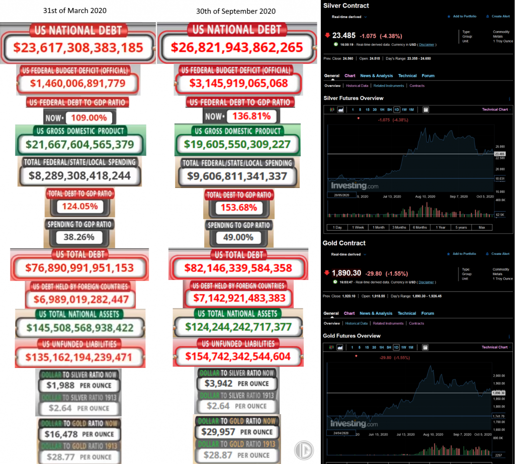
As to exactly how much shit is in the reservoir… well. I’ll leave you with this final picture, compiled from my recent 3rd Quarter USdebtclock.org update for your convenience. Buy physical folks! It’ll save your life. Soon.
Kirian “Deso” van Hest.
Find me at: Twitter.com/Desogames (for messages/contact!)
Twitch.tv/Desogames (for future streams/podcasts/content!)
PS; Check out my other work, such as:
The Comex being drained of all physical Silver and Gold (gee i wonder why) with the mysterious appearance of Shadowcontracts and an overarching pattern of manipulation:
https://twitter.com/DesoGames/status/1311953514395054080
The full 3rd Quarter US Debt clock update thread (with commentary):
https://twitter.com/DesoGames/status/1311639977818836993
Thanks for reading!